About the Author: Griffin West is an account coordinator at Performance Marketing, Thinc Iowa’s brand and identity partner.

It’s that time of year again. The leaves are turning from green to brilliant oranges and reds. The weekend grilling ritual gradually gives way to simmering pots of chili on the stovetop. Neighbor kids are throwing the football in the front yard …
And Thinc Iowa is almost here.
All of us here at Performance Marketing cherish this time of year. Like having Christmas come early, it’s when Silicon Prairie News tells us to throw caution to the wind, to let the creative juices flow freely and to take an idea and run with it. And we do exactly that.
This year is no exception. Our friends at SPN once again graciously offered us the opportunity to participate, so we rolled up our sleeves and put our proverbial noses to the grindstone.
 

Creativity in action: Performance Marketing creative partner Jim Swanson helps to build the Thinc Iowa 2012 identity.
As you may have noticed, one of the most distinguishing features of the 2012 Thinc Iowa identity is the old-school, “back-to-the-chalkboard” theme. This is almost in complete contrast to the complex and glitzy identity of the 2011 Thinc Iowa event. Here at PM, we thought that this played well with the event’s image because Thinc Iowa itself is evolving and changing, too! If the inaugural event was all about networking between startups and corporations, be looking for the 2012 event to be focused on the raw entrepreneurial spirit – thus the gritty, in-your-face chalkboard theme was born.

If we get down to the nuts and bolts of the development of the 2012 identity, a chalkboard symbolizes learning, simplicity, and provides a hip, retro twist on the transfer of information, which, let’s be honest, is at the core of Thinc Iowa.
On top of all that, as our own Emily Hughes (PM art director and design mastermind) puts it, “The chalkboard theme is just really hot right now, and it is always fun to be part of a ‘design for design’s sake’ project.” With over 90 percent of the type on the website being hand-drawn, a lot of dedication (and caffeine) went into rounding out the 2012 Thinc Iowa image.
 

PM’s Emily Hughes hard at work on the Thinc Iowa identity.
You can also expect a few surprises at Thinc Iowa this year. Even though we won’t totally give ourselves away, we will say that the identity will be incorporated throughout the show, including the photo booth, which was a big hit last year… Hint: This year’s photo booth may or may not involve quote bubbles.

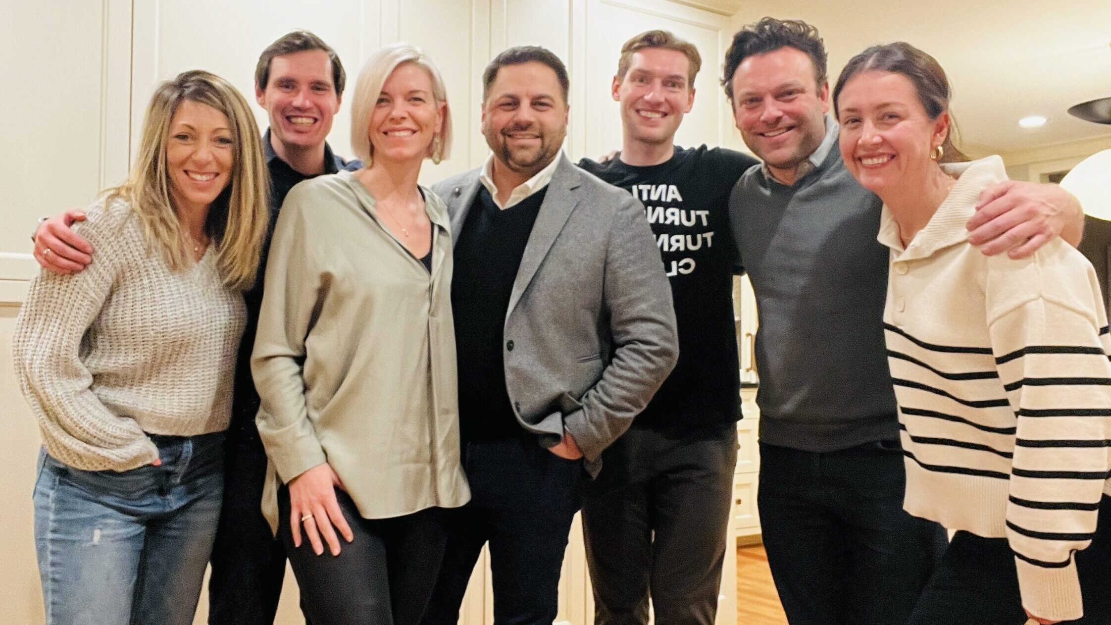
The PM crew goofs around in the photo booth at the 2011 Thinc Iowa event.
For us at Performance Marketing, participating in the creative process of Thinc Iowa is a great experience. In addition to helping our community make a name for itself as a hotbed for great ideas, being part of such a groundbreaking industry event also keeps our design team on their toes and allows us to flex our creative muscle in a big way.
We expect huge things from the 2012 Thinc Iowa event, and, once again, we are so proud to be the creative partner of Silicon Prairie News.
Here’s to an awesome Thinc Iowa 2012!
Credits: Performance Marketing photos courtesy by Performance Marketing. Thinc Iowa 2011 photo booth photo by Anna Jones | Art of Photography and Ikonix.


